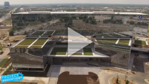
Project Innovation Zurich NA Headquarters
Inspired by his visit to Zurich Insurance Group’s new headquarters, Walker Thisted, BuiltWorlds producer and resident architect, talks to us about how the project originated and the design concepts and elements that were used in the final building.
Many options were available to Zurich Insurance Group when they outgrew their North American headquarters in the Chicago suburb of Schaumburg. They could:
 Remain in Zurich Tower and extend their footprint to nearby buildings,
- Follow the trend of companies such as McDonalds, Motorola Solutions, and Kraft Heinz that relocated their headquarters to downtown Chicago, or
- Explore new options in Schaumburg or another suburb.
Ultimately, they decided to buck trends and remain in Schaumburg, influenced by their many employees living in nearby suburbs and the fact that executives and clients appreciated proximity to Chicago O’Hare Airport. The generous tax incentives provided by the City of Schaumburg didn’t hurt, either.
After determining that expanding their existing headquarters would not be sufficient, they began looking for a site for a new building. The winning location provided high visibility from the interstate and sufficient land to create a building with large floor plates.
WHO WAS INVOLVED?
The site selection process began in close collaboration with Clayco who would serve as the developer and design/build contractor of the building that Zurich would lease. Jones Lang LaSalle was brought on board shortly after.
To select an architect, Zurich held an ideas competition and eventually chose Goettsch Partners for their iconic and direct design comprised of two nearly parallel five story office volumes separated by a large entrance atrium and a third office volume stacked at a ninety degree angle on top of the first two.
THE DESIGN
Goettsch’s design for the 783,800-square-foot LEED Platinum building evokes a sense of strength and stability in the way the bars hold the massive upper volume supported by three substantial six-story trusses that run its length. The cantilevered section of the bar extends toward downtown Chicago in a symbolic gesture of connection.
A soaring three-story double wall fabricated by Ventana on the south façade of the atrium supports adaption to Chicago’s changing climate and creates a striking impression upon entry. And the truss-supported upper volume and wide column bays of the lower volumes, unlike their former center-core tower office, provides added flexibility while also accommodating floor-to-ceiling windows that optimize solar orientation.

CannonDesign joined the team as interior architect to help Zurich realize the flexibility of its many collaborative spaces, from open office areas to conference rooms, private offices, and small group work rooms. CannonDesign detailed the space with the blue associated with the Zurich brand, tactile textures, and materials that help occupants navigate the building, break up the large spaces, and connect to the scale of the human body. By doing so, they drew on a highly precise Swiss sensibility (a nod to Zurich’s home country) while also introducing warmer materials to support regional identity.
Even if Zurich continues to grow, the architects have designed the office bars to be extended to house more employees so the company can continue to enjoy their home for years to come.


Discussion
Be the first to leave a comment.
You must be a member of the BuiltWorlds community to join the discussion.